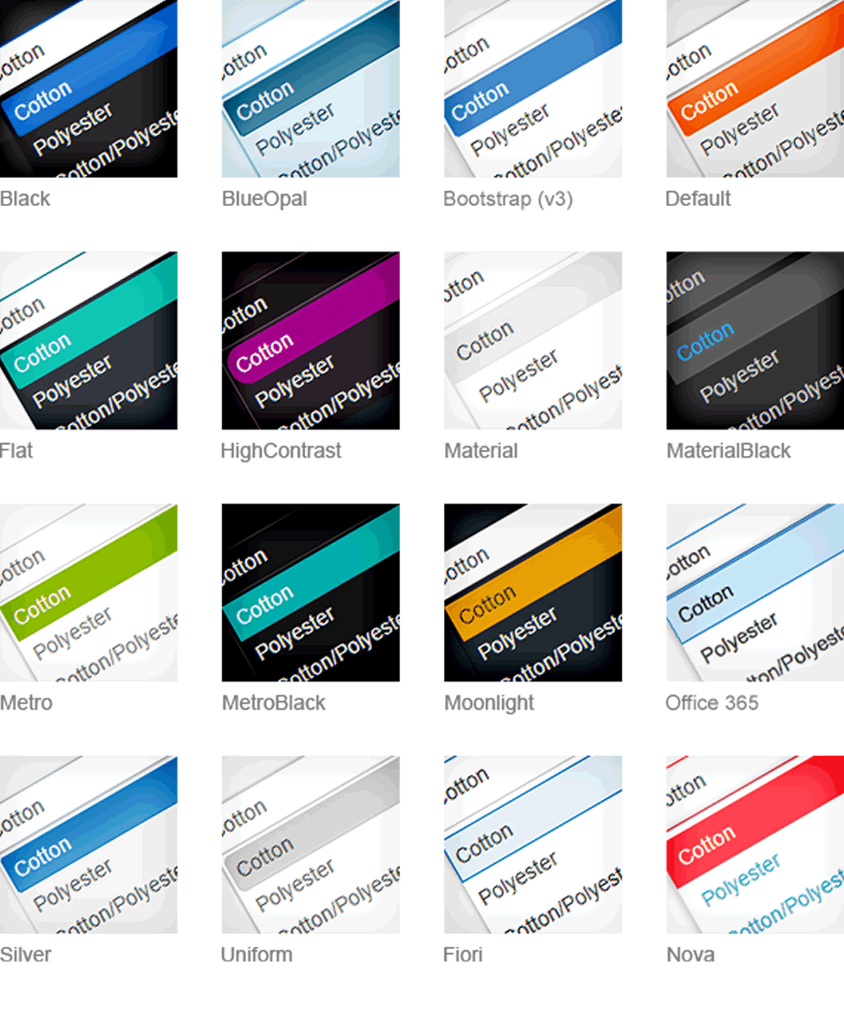
Theme Settings in the administrative web interface.
|
Jun 24 |
Galaxie Blog has 14 different beautiful default themes that you can choose from. Each theme can be easily customized using a web interface. You can have as many themes as you want, or design a single theme, but you should first choose a default theme from which to start with. All of the default themes can be viewed by clicking on the themes link at the top of each page. Once you choose a theme, you can adjust the settings of the theme, such as changing the header properties, page display settings, changing Logos, etc. After modifying the default theme to your liking, you can further fine tune the look and feel using a web based theme builder interface. I will cover how to use the theme builder in later posts. 

 Once you have selected your preferred theme, you can disable the other themes by deselecting the Use theme? checkbox under the Default Themes section in the administrative settings interface. Don't worry about losing a theme, you can always enable any theme by checking the checkbox next to the disabled theme.
There are 39 unique theme settings that can be independently applied to each theme. Theme settings are applied using the Settings page in the Blog administrative site. I will briefly go over each new setting here. It it safe to play around with these settings. If you make a mistake, you can always reset the default settings for the particular theme by clicking on the reset theme button at the bottom of the settings administrative page. Notes: this blog is highly optimized for mobile, and some of these settings will not apply. I have indicated what settings are not available to mobile devices in the notes section below. The following three settings are global, and affect all themes. 
- Parent Site Name and Link: The parent site name and parent site link form elements controls the behavior of the menu found at the top of the header. It allows the user to add an option in the menu that links to their home site.
- The Parent Site Name will display the title of the site within the menu. On my site, the text is Gregory Alexander - Web Design. The Parent Site Link can be any link to another site. The link is triggered when a user clicks on the menu option. On this site, the link is www.gregoryalexander.com.
- Default Font Size will set the font size for the blog content. You can choose any value between 8 and 26 points. Note: the Default Font Size will not change the size of the text in the header. I manually set the header text to be at 16 point in the menu on desktop devices, and 12 points for mobile devices.
 All of the settings below can be set by theme. Each theme operates independently, and can have its own unique settings. You can modify or create 14 different themes.
- The Modify Default Themes checkbox is used when the owner of the blog is ready to modify the default themes. Until this button is checked, the site will operate as it is intended here, with the default settings intact.
- The Kendo Base Theme allows the blog owner to review all of the default blog settings. Blog owners can look and see where the current images are stored, what library paths are used, and determine the element properties of the containers on the site. It is recommended that you browse the existing themes, and choose the theme that is closest to the theme that you want to create. In order to modify a theme, click on the default theme that you are interested in, and modify the settings that are displayed in the form.
- Kendo Theme .css Location (string): if you want to create your own Kendo less based theme and replace the existing .less based theme, use the Kendo Theme Builder to modify the base theme, upload it, and change the default path and point it to the new .less file that you created using the Kendo theme builder.
- Kendo Mobile Theme .css location (string): when you create your own Kendo theme, make sure to also specify the new path of the mobile theme as well.
- Custom Theme Name (string): provide the theme name that you want others to see when they look at your own site. This setting has no effect on the 1.1 version, but is a placeholder for the next major release.
- Dark Theme (true/false): Galaxie Blog has built in logic to pull in different resources depending upon the overall color of the theme. If the theme has a dark background for example, Galaxie Blog will pull in a different version of the code highlighter. There are quite a few different adjustments that are made, but it is up to you to determine whether Galaxie Blog should adjust its logic for to adapt to a light or a darker screen background. You can see this in action by comparing the following two default themes: Blue Wave (a light theme with dark text) and Blue Wave Dark, a dark theme with white text.
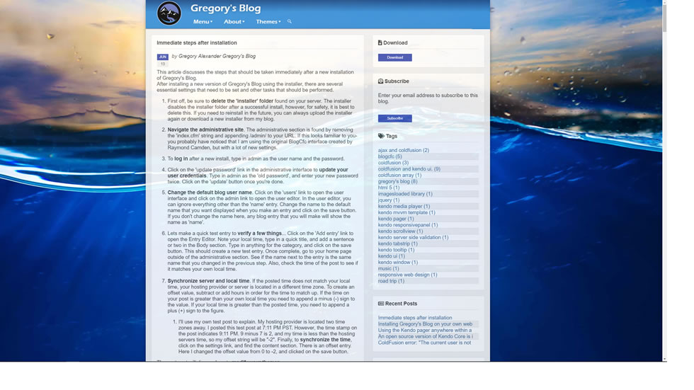
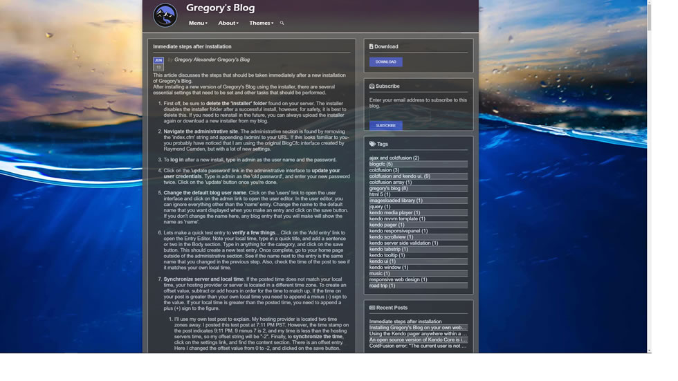
- Blog Content Width (numeric): The current blog content is set at 66% of the screen and should be left at this setting unless you set it much higher. When you're looking at the blog, you can see that the blog content portion in the center of the screen. The blog content section may contain the header (we will go over this later), the blog content that contains the blog posts, the side bar to the right which contains the links to the various parts of the site (such as the subscribe interface), and the footer. The blog owner can adjust this as they see fit, they can set it to 100% if they don't want any background image at all. However, unless you want to set this quite a bit higher, it is strongly recommended to leave this particular setting at 66%. If this setting is set at 66%, the background width is programmatically optimized and will change depending upon the screen width of the device. Note: this setting has no effect on mobile devices. To illustrate, the blog content width set at 100% is shown below (the 'Main Container' and 'Pod Container' widths were kept at default settings (65% and 35%)).

- Main Container Width (numeric): the main container holds all of the blog posts. It is currently set at 65% of the Blog Content Width (see above). If you set this higher, or lower, the side bar (also known as the 'pod width') to the right will also be adjusted accordingly. This setting has no effect on mobile devices. Note: the Main Container Width plus the Pod Container width will always equal 100. The following image has the following settings:
- Blog Content Width: 50%
- Main Container Width: 50%
- Pod Container Width: 50%


- Pod Container Width (numeric): the pod container is the section to the right of the main container. It contains the subscribe interface, tags, recent posts, etc. The current setting is set to 35%, but you can adjust it as you see fit. Notes: if you change this setting, the Main Container Width will be adjusted accordingly. This setting has no effect on mobile devices. The Main Container Width plus the Pod Container width will always equal 100.
- Opacity (numeric): If you look carefully at the site, you can see a faint trace of the background image underneath. I prefer this look as it creates visual interest. The opacity settings are different depending upon the theme, but you can change this setting to your own liking. You can set it at 100% to eliminate the opacity, or set it lower than the current setting if you want the background to bleed through. The image to the left has opacity set at 80%, and the right image is set at 99%.


- Background Image (string): enter the absolute path to the image that you want shown as the background image for the desired theme. If you prefer the look of a clean site without any background, or don't want any background at all, leave this blank. Additionally, you can specify an image that will create a background pattern, and use the next variable, Background Image Repeat .css, to create a unique pattern as a background. The image below does not have a background image set
![]()
- Background Image Repeat .css (string): you can use any valid background image repeat .css. This was built into the themes as a blog owner may want to create sophisticated pattern objects for the background. The pattern shown below image has the following settings:
- Background Image Repeat: repeat


- Background Image Position .Css (string): setting your favorite background 'hero' image using the default 'center center' is not always the best approach. The background image position rule allows you to set the background image to exact coordinates to make sure that it looks good on all screen sizes. See background position for more information.
- Stretch Header across Page (true/false): if you want your header to consume the entire width of the page, set this to true. The default setting is false. On mobile devices, this setting is automatically set at 100%. The image below is set to true.


- Align Header with Content (true/false): the default setting is true for all of the current default themes, but setting this to false allows the header to be set at the far left or right of the page, or the absolute center. Leaving this to true adjusts the size of the header to fit the width of the content width (see Blog Content Width).
The image below has the Align Header with Content set at false with menu align center.
Note: this setting is only relevant if the Stretch Header across Page is set to true. - Menu Align (left, center, right): you can align the header to the left, center, or right. Use this in conjunction with the Align Header with Content and Stretch Header across Page properties to create the look that you like.

- Header Background Image (string): currently, I use simple images with various gradient fills that are used as the header background. You can set the header background to use any image. You can get creative here, perhaps you want an image that is filled with a pattern, or a header that displays lots of floating bubbles, it is your call.


- Cover Menu with Menu Background Image (true/false): this setting is a bit complex. For my personal Zion and Orion themes, I wanted a the color scheme on the menu to match the color scheme of the background images and the .less theme file that controls the forms and widgets. In order to have the selected menu item match the orange color scheme, I 'covered' the Kendo menu with the background image that I used on the header with .css. This setting allows the menu background image to be shown within the Kendo menu itself. All of the other current themes have this setting set at false. Setting this to false should be sufficient in most cases; the menu is already tailored to the .less based theme that is set. However, there are reasons that a blog owner may want to set this to true on occasion. For example, if a blog owner creates a menu image with a lot of little floating bubbles, setting this to true will also allow the menu items to show these little bubbles as well.
- Mobile Logo Image (string): You will want your mobile logo image to be much smaller than the logo image for desktop devices. Enter the absolute location of the image.
- Mobile Logo Image Width (numeric (pixel width): this typically is set to be 60 pixels or less.
- Desktop Logo Image (string): enter the absolute path pointing to the location of your logo that will be shown on desktop devices.
- Logo Padding (top, right, bottom, left)': you can fine tune the logo placement with these settings. The default settings are left at 0px.
- Blog Name Text Color (hexadecimal string): this setting controls the text color of all of the items in the menu. Use any valid hexadecimal or valid HTML color value. If using a hexadecimal value, make sure to put a pound in front of the hexadecimal string it as well.
- Header Divider Image (string). This is the horizontal image divider that separates the header and the blog content, and the blog content and the footer. Currently, it is a little grey bar, but you can design your own and specify it here using an absolute path.
Related Entries
- An open source version of Kendo Core is incorporated in Galaxie Blog
- Installing Galaxie Blog on your own website.
- Immediate steps after installation
- Fine tuning your theme with Kendo Theme Builder
- Introducing Galaxie Blog
- Incorporating the AddThis library to set up social media sharing with Galaxie Blog
This entry was posted on June 24, 2019 at 6:40 PM and has received 1804 views.