Gregory's Blog

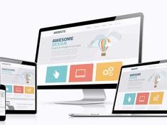
Responsive Web Design


I am spending quite a bit of time making the new blog responsive. My goal is to make the mobile site fully functional and to make it look as nice as the application on the web. I ran into some major hurdles. For example, the original code formatter, developed by Jason Delmore, expanded beyond the mobile device size. I re-wrote quite a bit of the logic in the formatter, but I did not want to re-write the core logic that provides the formatted code and lines. I had wanted to re-write every inner div and span that used position: absolute underneath the constraining parent div that had position, relative, but gave up as there were so many div's and spans. There is so much logic in the formatter that I gave up thinking about making the code responsive and instead I constrained the content like so: CSS:

/* The constrainer table will constrain one or many different div's and spans to a certain size. It is handy to use when you are trying to contain the size of elements created by an older libary that does not use responsive design. */
#constrainerTable {
	/* The parent element (this table) should be positioned relatively. */
	position: relative;
	/* Use the root width var */
	width: var(--contentWidth);
	/* Now that the parent element has a width setting, make sure that the width does not ever exceed this */
	max-width: 100%;
}	
		
/* Helper function to the constrainerTable to break the text when it exceeds the table dimensions */
#constrainerTable .constrainContent {
	max-width: 100%
}
th {
	max-width: var(--contentWidth);
}
td {
	word-break: break-word;
	min-width: 50px;
}

And the HTML:

<!-- Post content --> 
<!--- Note: Delmore's code formatter is not mobile friendly and it does not use responsive design. This table will constrain the content to a certain variable size. --->
<table id="constrainerTable" class="constrainContent">
	<tr>
		<td>
			<!--- Blog post. --->
			#application.blog.renderEntry(body,false,enclosure)#				
		</td>
	</tr>
</table>

Fixed background image settings for mobile devices: To use a fixed background, the main arguments here are display: block, position: fixed, z-index:-10

body:before {
	content: "";
	display: block;
	position: fixed;
	left: 0;
	top: 0;
	width: 100%;
	height: 100%;
	z-index: -10;
	background: url(<cfoutput>#blogBackgroundImage#</cfoutput>) no-repeat center center;
	-webkit-background-size: cover;
	-moz-background-size: cover;
	-o-background-size: cover;
	background-size: cover;
}

Opacity settings for mobile devices: The web application has a nice opacity effect where the theme's background image bleeds through into the interface. To accomplish the same effect for iOs devices, I used: opacity: .92 and visibility: true.

/* Opacity for iOs */
opacity: 0.<cfoutput>#siteOpacity#</cfoutput>;
visibility: visible; 

This entry was posted on February 12, 2019 at 6:01 PM and has received 626 views.

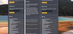
Kendo Responsive Panel


I ran into someone posting the same scrolling question as I was looking to solve on stack overflow, but could not find anything else on the web. The responsive panel is used to provide a slide-out menu on mobile devices when you click on what is commonly known as a 'hamburger. The panel is used in responsive web design and is triggered when the device reaches a certain minimum screen width. Here is the code that I developed for this blog:

<nav id="sidebarPanel" class="k-content">
	<!---Suppply the sideBarType argument before loading the side bar--->
	<cfset sideBarType = "panel">
	<cfinclude template="includes/layers/sidebar.cfm">
</nav><!---<nav id="sidebar">--->
			
<!--- This script must be placed underneath the layer that is being used in order to effectively work as a flyout menu.--->
<script>
$("#sidebarPanel").kendoResponsivePanel({
	breakpoint: 1280,
	orientation: "left",
	autoClose: true
})
.on("click", "a", function(e) {
	$("#sidebarPanel").kendoResponsivePanel("close");
});
</script>

There were several challenges that I ran into when developing this. First, I tried to use the same div element that I use on the right side of the page to hold the various widgets, such as the calendar, subscribe, recent posts, etc. However, I noticed that if I tried to use the same div for the responsive menu, I could no longer apply certain css properties to the panel, and it was stuck at the top of the page. To solve this, I used a different div at the end of the application to serve as the responsive panel, duplicated the logic from the right column, and put it into the new panel at the end of the page. I also created a script to show the new responsive panel when the screen size hit the breakpoint setting (1280 pixels), and hid the original div that is on the right column. Here is the relevant portions of the code:

// Handle the sidebar and the sideBarPanels
if (windowWidth <= 1280){
	// Hide the sidepanel (the responsive panel will takeover here).
	$( "#sidebar" ).hide();
	// Show the responsive panel
	$( "#sidebarPanel" ).show();
} else {
	// Show the sidebar, and hide the responsive panel
	$( "#sidebar" ).show();
	$( "#sidebarPanel" ).hide();
}

Second, the hamburger showed up, but it closed as soon as I tried to open it. I found the following solution while searching the web:

// Important note: this is a workaround with a google chrome bug and mobile devices. 
// This prevents the following error: "Intervention] Unable to preventDefault inside passive event listener due to target being treated as passive."
// See https://github.com/telerik/kendo-ui-core/issues/3556
$(".k-rpanel-toggle").on("touchend", function(e) { 
	 e.preventDefault();
});

Third, I ran into problems where to put the resonsivePanel initiation script. I found out that it must be at underneath the actual element that it will be placed into. It now works, however, there is a big problem. I could not scroll down the responsive panel when it was triggered. It just stayed in a fixed position and only showed the top part of the page. I looked everywhere in the Kendo site, and then on the internet, looking for some arcane argument that I could use, such as scrollable: true, but couldn't find any. I then looked at the similar jQuery UI menu, and inspected Telerik's production page which has a responsive panel and found that they both used the css declaration: position: absolute;

position: absolute;

Fourth. Ok, that fixed that problem, but now the div layer disappeared at the bottom of the page. I tried setting height to 100%, but that failed too. So I looked at both jQuery and Kendo's panels again, and noticed that they also used: height: auto;

height: auto;

Also, use the autoclose argument to be false on the responsive panel widget, otherwise you won't be able to able to keep the layer open when scrolling past the bottom of the first page. That worked! The panel can be scrolled now. The final working code is pasted below: CSS:

/* The side bar panel is essentially a duplicate of the sidebar div, however, it is a responsive panel used when the screen size gets small. */
#sidebarPanel {
/* We are going to eliminate this sidebar for larger devices, and activate it when the screen size gets to a certain size. */
display: none;
/* Note: the panel will not scroll with the blog content unless there is a css position: absolute. */
position: absolute;
margin: 0;
/* Apply more padding to the right to keep things uniform. */
padding: 20px 40px 20px 20px;
width: 45%;
/* Note: if you don't set 'height: auto', the panel will not be displayed below the bottom of the page. */
height: auto;
vertical-align: top;
overflow: visible;
border-right: thin;
		
/* Put a drop shadow on the panel when it is expanded. */
#sidebarPanel.k-rpanel-expanded {
         box-shadow: 0 0 10px rgba(0,0,0,.3);
 }

CFML:

<!---This is the sidebar responsive navigation panel that is triggered when the screen gets to a certain size. It is a duplicated of the sidebar div above, however, I can't properly style the sidebar the way that I want to within the blog content, so it is duplicated without the styles here.--->
						
<!--- Side bar is to the right of the main panel container. It is also used as a responsive panel below when the screen size is small. --->
<nav id="sidebarPanel" class="k-content">
<!---Suppply the sideBarType argument before loading the side bar--->
<cfset sideBarType = "panel">
<cfinclude template="includes/layers/sidebar.cfm">
</nav><!---<nav id="sidebar">--->

Javascript:

<!-- This script must be placed underneath the layer that is being used in order to effectively work as a flyout menu.--->
$("#sidebarPanel").kendoResponsivePanel({
	breakpoint: 1280,
	orientation: "left",
	autoClose: false // set this to false if you want the layer to stay up when you want to sroll down.
})
.on("click", "a", function(e) {
	$("#sidebarPanel").kendoResponsivePanel("close");
});

// Important note: this is a workaround with a google chrome bug and mobile devices. 
// This prevents the following error: "Intervention] Unable to preventDefault inside passive event listener due to target being treated as passive."
// See https://github.com/telerik/kendo-ui-core/issues/3556
$(".k-rpanel-toggle").on("touchend", function(e) { 
	e.preventDefault();
});

This entry was posted on February 10, 2019 at 12:38 AM and has received 2453 views.


Footer Logo

Your input and contributions are welcomed!

If you have an idea, BlogCfc based code, or a theme that you have built using this site that you want to share, please contribute by making a post here or share it by contacting us! This community can only thrive if we continue to work together.

Images and Photography:

Gregory Alexander either owns the copyright, or has the rights to use, all images and photographs on the site. If an image is not part of the "Galaxie Blog" open sourced distribution package, and instead is part of a personal blog post or a comment, please contact us and the author of the post or comment to obtain permission if you would like to use a personal image or photograph found on this site.

Credits:

Portions of Galaxie Blog are powered on the server side by BlogCfc, an open source blog developed by Raymond Camden. Revitalizing BlogCfc was a part of my orginal inspiration that prompted me to design this site.

Version:

Galaxie Blog Version 3.12 (Toby's Edition) December 10th 2022 Blue Wave Dark theme