Kendo Scrollview
|
Apr 16 |

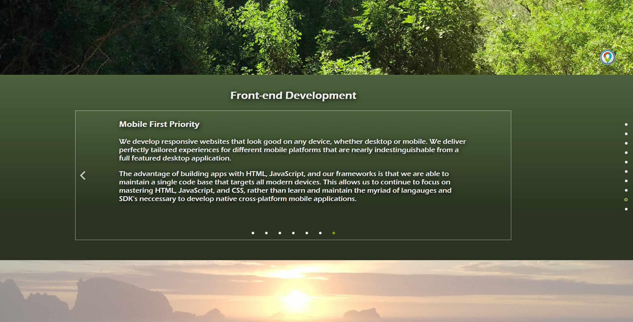
I have been using the scroll view on my home site at gregoryalexander.com quite a bit and wanted to pass along a few tips. If you want to change the button size on the scroll view, use the following CSS. The default font size is around 2em, to make the right and left arrows bigger, use anywhere from 6-8em, and 1em to make the arrows a bit smaller.
#nameOfScrollViewDiv .k-scrollview-next span, .k-scrollview-prev span {
	font-size: 8em;
}
To use the scrollview to display a lot of text, I used the following approach. First, we need to use data-role='page' and create a 'white-space:normal' style for every element in order to allow for the text to wrap properly instead of going off of the scrollview page:
<div id="developmentScrollView" class="blueGradient">
	<!-- This is used for every page -->
	<div class="getConnected" data-role="page" style="white-space:normal;">
</div>
To constrain the text and allow the arrows to be seen visibility on the right and left, I created a css class for the div that contains the actual scrollview, and wrapper classes that constrain the text information in the proper spot. The class for the scrollview div (the outer class in this case):
/* Scroll view outer containers within the content blocks. */
#developmentScrollView {
	/* Text color */
	color: rgba(255, 255, 255, 0.9);
	height: var(--scrollViewHeight);
	width: var(--scrollViewWidth); /* Don't use dynamic css vars set when the page loads. It screws stuff up. */
	margin: auto;
	z-index: 2; /* This needs to be higher than the nav blocks */
}
And the three wrapper classes: the first class (firstScrollviewWrapper) is used on the first slide, and the second class (scrollviewWrapper) controls all of the slides after the first and last slide, and the last class (lastScrollviewWrapper) is used for the very last slide. These are used to keep the text separated from the arrows in order to make the arrows more visible.
.firstScrollviewWrapper {
	position: relative;
	display: table;
	left: 0%; /* The 2nd and x slides there after start to the right of the left arrow. */
	right: 10%;
	margin: auto;
	width: 80%; /* the width of the scroll view container. */
	text-align: left;
	font-family: var(--scrollViewFont);
	font-size: var(--scrollViewFontSize);
}

.scrollviewWrapper {
	position: relative;
	display: table;
	left: 0%; /* The 2nd and x slides there after start to the right of the left arrow. */
	right: 10%;
	margin: auto;
	width: 80%; /* the width of the scroll view container. */
	text-align: left;
	font-family: var(--scrollViewFont);
	font-size: var(--scrollViewFontSize);
}

.lastScrollviewWrapper {
	position: relative;
	display: table;
	left: 0%; /* The 2nd and x slides there after start to the right of the left arrow. */
	right: 0%; /* The last slide does not have a right arrow that we need to leave room for. */
	margin: auto;
	width: 80%; /* the width of the scroll view container. */
	text-align: left;
	font-family: var(--scrollViewFont);
	font-size: var(--scrollViewFontSize);
}
Tags
Kendo scrollview|
|
Gregory Alexander |
|
Hi, my name is Gregory! I have several degrees in computer graphics and multimedia authoring, and I have been developing enterprise web applications for the last 25 years. I love web technologies and the outdoors and am passionate about giving back to the community. |
|
This entry was posted on April 16, 2019 at 9:57 PM and has received 1900 views.
